Welcome to part two of our blog series where we’re demonstrating a few ways to achieve a more polished look to your Self Service Portal.
This post is going to show you how you can provide more clarity and structure to the “Search Result” widgets (e.g. My Tickets and Knowledge Articles). Although you can easily switch between the card and table layouts for these widgets, they frequently suffer from being too cluttered and all of the information in them tends to just blend into a mass of text.
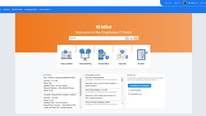
Here’s where we left off from the last blog post
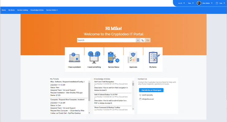
In the screenshot above, we have two Search Result widgets, one for My Tickets and one for Knowledge Articles. There’s so much we can do to improve these. But let’s first take a look at the options available from the widget editor.
Of course, it’s possible to customise these grids, but the real problem is that it’s just not practical to have that much information contained in a small page element regardless of whether it’s the card view or the grid view.
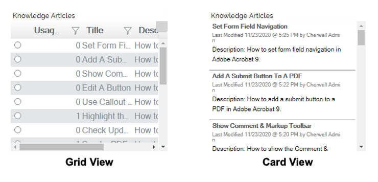
Let’s just break down the issues with the Card View to work out an action plan.
- Too much (irrelevant) information – The typical Self Service user will not be interested when or who last modified each article. Let’s cut this all out
- Duplicate information – The article title and description are too similar and don’t provide any additional value. Without getting confirmation that we can rely on the authors to provide value in the description text, we’ll assume that it’s safe to just remove the description.
- Too much text – Some of this text can be represented by icons or colours.
- Wrong font – We need to switch it over to use the great fonts we added in the previous post.
- Pretty ugly scroll bar – We’re on a landing page where users expect a quick overview of useful information. They don’t want or need to scroll through pages of articles.
The combination of the issues above have the effect of making the page appear somewhat dated and it doesn’t look particularly user friendly.
The solution
1. Tackle the clutter
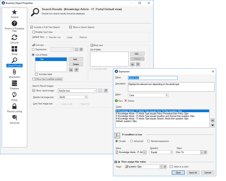
It’s a straightforward job to remove all of the unnecessary data from this widget. We know it’s showing “Knowledge – IT” records, so in the business object properties (Portal View), we can set what data we want to be shown by changing the following settings.
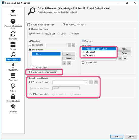
I’ve made a few changes below, including configuring an expression to display a helpful icon against each article which is dependent on the article type being shown.
Unfortunately, after publishing, you can see that you’re only part of the way there!
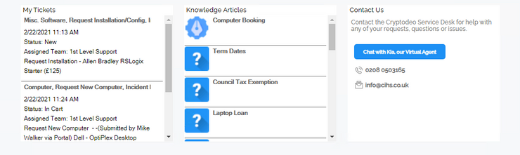
It’s not really what I had in mind
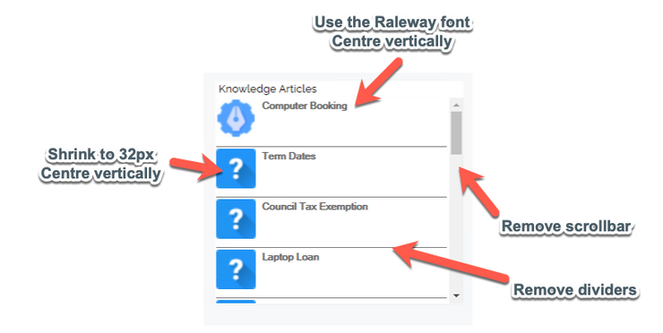
The most glaring issue to me was that the icons are still too large. After a bit of digging, I found that the JavaScript which renders this data to screen doesn’t abide by the image size defined in the blueprint. It’s hard-coded be 48px square.
It’s a little inconvenient because I was hoping to get closer to the look I wanted just by using Themes and maybe a bit of CSS. But, as almost all of the HTML for this element is defined in the JavaScript, we’ll need to make a few more changes to the code than expected.
It’s not ideal, but we know that in the event of an upgrade, this will fall back gracefully to what you can see above. It’s likely the same changes can be re-applied without a need to re-work them.
2. Apply some style
So here’s a rough idea of the changes I’m going to implement
The file we need to edit is stored in dist/Bundles/dashboard/ and is named bundle.dashboard.js. As touched on in the previous blog post, this file is minimised, so you’ll need to prettify it in Visual Studio Code if you want to edit it and keep your sanity.
Looking at the Developer Console in the Chrome browser, we can see the style that’s being applied to the image.
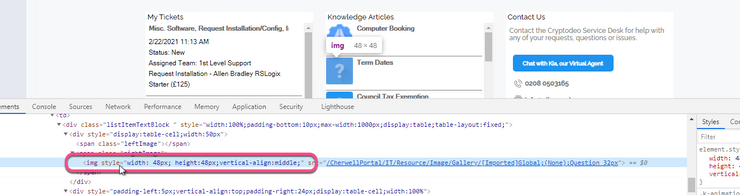
And it’s quite easy to find the corresponding lines in the JavaScript:
The standard HTML template for these elements.
I’ve changed the image size to 32px, added a bit of left padding and changed the container size to 42px
A few modifications to change how the image is displayed
This is the result of those changes above. We can see that it’s moving in the right direction. Vertical alignment is still an issue.
Making a few further modifications to the template, we can easily get it looking much cleaner.

I’ve highlighted the changes above. You can click to zoom the screenshot, but don’t worry if you still can’t see what’s happening, the code changes will be included at the end of the post.
For some reason, the theme editor won’t allow us to select our custom font for this element, but we can apply the font by adding Font-Family properties in the file bundle.TrebuchetCore.css, which we discussed in the previous post.
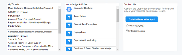
The Result
As you can see, the result is pretty effective.
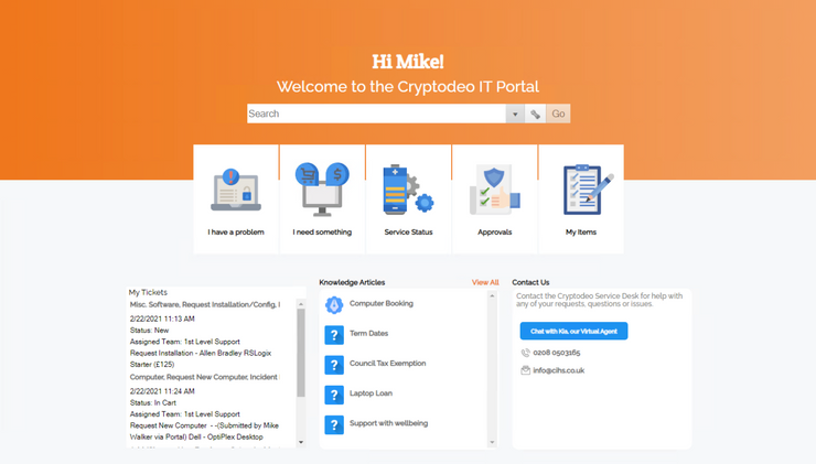
You might notice that I’ve made a few other changes, but only using the standard dashboard editor.
I’ve limited the search results to five entries. This is in preparation for removing the scroll bar – I’ll be dealing with all the scrollbars in another post.
I’ve also begun to move the widget headings outside of the widget to give a bit more flexibility and keep the content cleaner – note the “View All” option for Knowledge Articles.
I’m also moving to rounded corners.
In Summary
As you can see we can get most of the way towards our vision without too much effort, but it does take a little more time to meet very specific design requirements.
The files we changed today are;
dist/Bundles/dashboard/bundle.dashboard.js
Changing these lines starting line 6945
from this;
if (model.IsOffline) {
    selectable = false;
    model.RowTemplate = "<tr data-uid='#= uid #'><td><div class=\"listItemTextBlock \" style='width:100%;padding-bottom:10px;max-width:1000px;cursor:default;display:table;table-layout:fixed;' ><div style='vertical-align:top;padding-left:5px;padding-right:24px;display:table-cell;width:100%'><div ><span>#: OutputLinkText #</span><div id='actions' style = 'float:right;block:float;z-index:1000' ></div></div ><div class=\"listItemTextSubHeading\" style=''>#: OutputSubtitle #</div ><div class=\"listItemTextDesc\" " + textStyle + ">#= OutputLongText #</div></div></div></td></tr>"
    } else model.RowTemplate = "<tr data-uid='#= uid #'><td><div class=\"listItemTextBlock \" style='width:100%;padding-bottom:10px;max-width:1000px;display:table;table-layout:fixed;'><div style='padding-left:5px;vertical-align:top;padding-right:24px;display:table-cell;width:100%'><div " + textLinkStyle + " ><a class=\"listItemTextLink\" onclick='#: LaunchCommand #'>#: OutputLinkText #</a><div id='actions' style = 'float:right;block:float;z-index:1000' ></div></div ><div class=\"listItemTextSubHeading\" style=''>#: OutputSubtitle #</div ><div class=\"listItemTextDesc\" " + textStyle + ">#= OutputLongText #</div></div></div></td></tr>"
to this;
if (model.IsOffline) {
    selectable = false;
    model.RowTemplate = "<tr style='height:50px; ' data-uid='#= uid #'><td><div class=\"listItemTextBlock \" style='border-bottom:none;width:100%;max-width:1000px;cursor:default;display:table;table-layout:fixed;' ><div style='vertical-align:middle;padding-left:5px;vertical-align:middle;padding-right:24px;display:table-cell;width:100%'><div ><span>#: OutputLinkText #</span><div id='actions' style = 'float:right;block:float;z-index:1000' ></div></div ><div class=\"listItemTextSubHeading\" style=''>#: OutputSubtitle #</div ><div class=\"listItemTextDesc\" " + textStyle + ">#= OutputLongText #</div></div></div></td></tr>"
    } else model.RowTemplate = "<tr style='height:50px;' data-uid='#= uid #'><td><div class=\"listItemTextBlock \" style='border-bottom:none;width:100%;max-width:1000px;display:table;table-layout:fixed;'><div style='padding-left:5px;vertical-align:middle;padding-right:24px;display:table-cell;width:100%'><div " + textLinkStyle + " ><a class=\"listItemTextLink\" onclick='#: LaunchCommand #'>#: OutputLinkText #</a><div id='actions' style = 'float:right;block:float;z-index:1000' ></div></div ><div class=\"listItemTextSubHeading\" style=''>#: OutputSubtitle #</div ><div class=\"listItemTextDesc\" " + textStyle + ">#= OutputLongText #</div></div></div></td></tr>"
And these lines starting at line 7208
from this;
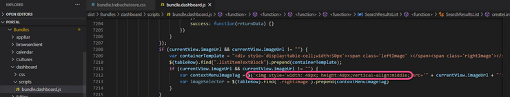
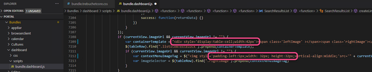
if (currentView.imageUrl && currentView.imageUrl != "") {
    var containerTemplate = "<div style='display:table-cell;width:50px'><span class='leftImage' ></span><span class='rightImage'></span></div>";

$(tableRow).find(".listItemTextBlock").prepend(containerTemplate);

    if (currentView.imageUrl && currentView.imageUrl != "") {
        var contextMenuImageTag = $("<img style='width: 48px; height:48px;vertical-align:middle;'src='" + currentView.imageUrl + "'>");
        var imageSelector = $(tableRow).find(".rightImage").prepend(contextMenuImageTag)
    }
}
to this;
if (currentView.imageUrl && currentView.imageUrl != "") {
    var containerTemplate = "<div style='display:table-cell;width:42px'><span class='leftImage' ></span><span class='rightImage'></span></div>";
                                                    $(tableRow).find(".listItemTextBlock").prepend(containerTemplate);

    if (currentView.imageUrl && currentView.imageUrl != "") {
        var contextMenuImageTag = $("<img style='padding-left:5px;width: 32px; height:32px;vertical-align:middle;'src='" + currentView.imageUrl + "'>");
        var imageSelector = $(tableRow).find(".rightImage").prepend(contextMenuImageTag)
    }
}
And for the file dist/Bundles/TrebuchetCore/css/bundle.trebuchetcore.css
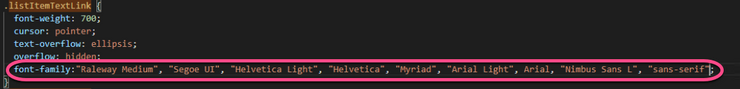
We changed the .listItemTextLink definition on line 271 from this;
.listItemTextLink {
  font-weight: 700;
  cursor: pointer;
  text-overflow: ellipsis;
  overflow: hidden;
}
to this;
.listItemTextLink {
  font-weight: 700;
  cursor: pointer;
  text-overflow: ellipsis;
  overflow: hidden;
  font-family:"Raleway Medium", "Segoe UI", "Helvetica Light", "Helvetica", "Myriad", "Arial Light", Arial, "Nimbus Sans L", "sans-serif";
}
We’re quite limited on the formatting of these blog posts, so I hope the changes are easy enough to read and copy. But if you do need any clarification, please feel free to get in touch.